Why Does My Website Look Professional but Still Not Generate Leads?
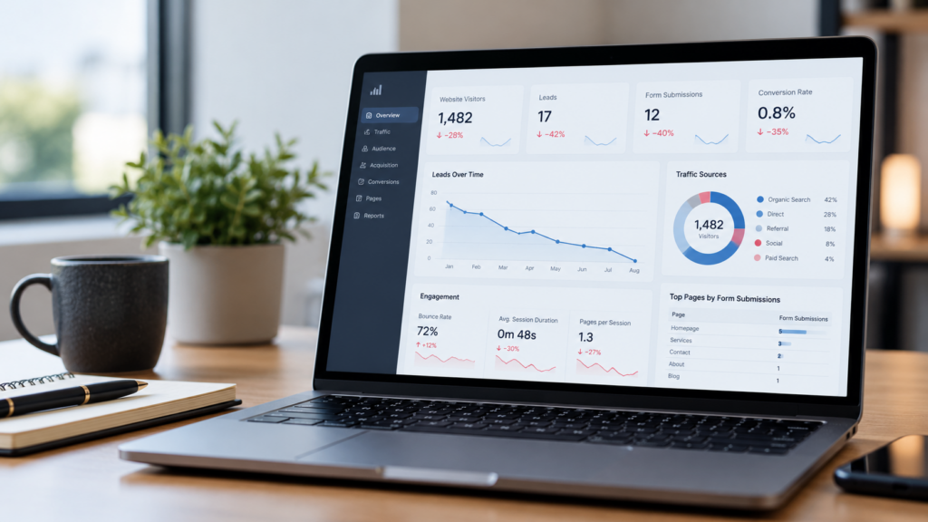
Your website looks good. The branding feels polished. The photos are sharp, the pages are modern, and nothing immediately looks “wrong.”
Here is a question: Why are so few clients contacting you?
This is an annoying issue, but certainly not a unique one. Not every professional-looking website is a lead-generationwebsite.
Hog the Web has been designing, running, and optimizing WordPress websites for 300+ growing businesses over the last 10+ years. We’ve learned that visual quality, while important, is only part of the conversion picture.
It should also explain, reassure, guide, and be easy to act on.
Can A Beautiful Homepage Still Confuse Potential Customers?
Absolutely. Beautiful design will not solve the problem if someone cannot figure out, in a few seconds, what you do, who you help, and where they should go (hint: pay attention to headings).
We recently saw this while Hog the Web redesigned the brand and website for Applied Marketing Science (AMS), a sharp Boston-based market research and customer insights consultancy.
AMS had significant experience, but concisely conveying the mix of research, consulting, training, and industry services wasn’t easy. We wanted to clarify those paths, not just give the site a new visual treatment.
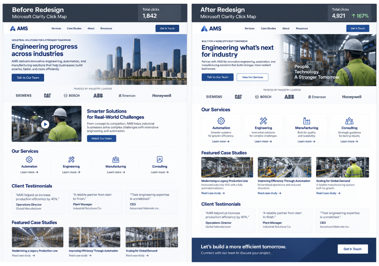
Over the first 42 days following launch, homepage engagement rose from 25.0% to 37.5%, a relative increase of +49.9%. Engaged sessions increased another 36.1%.
That result gets at something we think is easy to miss during a redesign: “Does this look professional?” and “Can a visitor understand it?” are two different questions.
Does Professional Design Create Enough Trust By Itself?
No. Good design can make a business feel credible initially, but people still look for reasons to believe the claims being made.
Stanford’s Web Credibility Project developed its credibility guidelines from research involving more than 4,500 people. Among its recommendations are making information easy to verify, showing that a real organization exists behind the website, highlighting expertise, and providing clear ways to contact the company.
In practice, that means “20 years of experience” is stronger when accompanied by actual projects. “Trusted service” becomes more believable beside a relevant testimonial. “We get results” is stronger when a case study shows what changed.
There was a good example of this on the new AMS homepage. Its testimonial and case-proof slider attracted roughly 7% of all recorded clicks, while case-study tabs generated another 3.4%.
Visitors were not just admiring the new design. They were actively investigating the proof behind the company.
Are Your Calls To Action Making Visitors Guess?
If buttons such as “Learn More” appear everywhere, they may look clean while giving visitors very little information about what happens next.
Nielsen Norman Group’s usability research recommends descriptive link and category names because people use those labels to predict what they will find after clicking. Vague labels create weaker “information scent” and make navigation harder.
Compare:
Learn More
with:
See Our Commercial Painting Work
Or:
Get WordPress Support
The second versions answer a tiny but important question: Where am I going?
This is one reason conversion problems sometimes hide inside very polished websites. The interface looks simple because the language has been simplified too far.
Is Your Contact Form Doing Too Much Work?
A lead form can quietly become a barrier when it asks for information the business does not actually need during the first conversation.
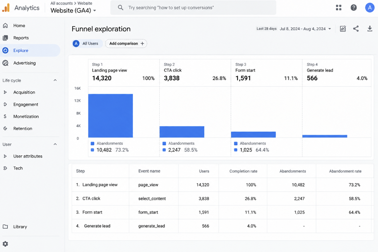
Google Analytics specifically recommends measuring how many people reach a form, start it, and submit it. That makes it possible to see whether prospects are disappearing during the form itself.
Baymard’s extensive form usability research, although focused primarily on ecommerce, reaches a useful conclusion: large numbers of visible fields can make forms feel intimidating. Its research recommends removing irrelevant fields and minimizing what users need to enter.
For a service business, the first form often does not need to conduct the entire sales interview.
Sometimes you just need enough information to start the conversation.
Could The Site Feel Professional On Desktop But Frustrating Everywhere Else?
Yes. Visitors experience the actual website, not the screenshot that was approved during the design process.
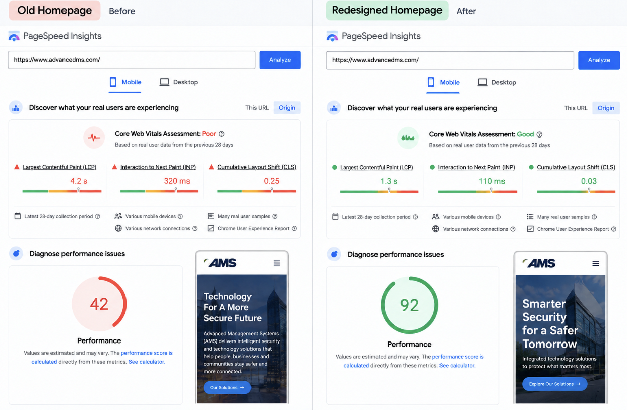
Google’s Core Web Vitals evaluate real-world loading speed, responsiveness, and visual stability. Google recommends LCP within 2.5 seconds, INP below 200 milliseconds, and CLS below 0.1.
A page can look beautiful in a design mockup but feel very different when a visitor opens it on an older phone, a slower connection, or a page loaded with third-party scripts.
For lead generation, we would pay particular attention to service pages and contact pages, not simply whichever page produces the worst performance score.
The page worth fixing first is often the one closest to revenue.
Do You Know Where People Actually Give Up?
If you only track sessions and form submissions, probably not.
A better view looks something like this:
Landing Page → CTA Click → Form View → Form Start → Form Submission
Google Analytics supports lead-generation events and recommends generate_lead when someone submits information that creates a lead.
Now the problem becomes easier to diagnose.
Plenty of page visits but almost no CTA clicks? Look at the offer, proof, and CTA.
Plenty of form starts but very few submissions? Look at the form.
That is much more useful than saying, “The website needs a better conversion rate.”
How Does Hog The Web Evaluate A Professional Website That Is Not Generating Leads?
We would look at four areas before assuming the answer is another redesign.
We call this the HTW Lead-Ready Website Audit:
Message Clarity
Can the right visitor quickly understand what the business does?
Proof & Relevance
Are testimonials, results, projects, and expertise visible when visitors need reassurance?
Action Path
Is it obvious where to go next, and is taking that step easy?
Technical Confidence
Does the site remain fast, stable, usable, and properly maintained across devices?
The AMS project is a useful example because the solution was not simply “make it prettier.” The redesign made services easier to understand, improved pathways through the site, surfaced stronger proof, and gave visitors reasons to keep exploring. Microsoft Clarity later showed the lower 65–100% of the homepage capturing 62.6% of measured attention, compared with only 14.2% before the redesign.
That is the kind of behavioral change worth measuring.
A Good Website Should Do More Than Look Good
If your website looks professional but still does not generate leads, another coat of visual polish may not be the answer.
The problem might be a vague message. Missing proof. A confusing next step. A frustrating form. A slow service page. Or several small issues working together.
Hog the Web combines WordPress web design and development, SEO, website maintenance, and ongoing support with a focus on how the website actually performs for the business.
The goal isn’t simply to build a website someone likes looking at.
It is to build one that helps the right visitor think, “Yes, this is what I need. What do I do next?”
Talk to Hog the Web about improving your website